A seemingly simple question to answer, the question of what a typeface is is quickly complicated by the introduction of other terminology. What is a font? How is it different from a typeface? Why are there different typefaces? For someone not well versed in typography (the typical person), broaching this topic for the first time can prove overwhelming. A first-time designer, for example, is suddenly faced with the question of whether or not they should use a serif of sans-serif font for their title. Should it be bold? When is it okay to use stylized fonts? There are no solid answers to these questions, but there are general rules which people follow, and this blog post will provide a quick overview of what typefaces are out there, how you can use them.
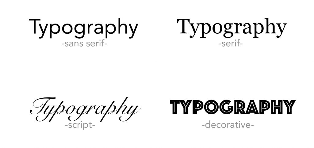
There are four basic typefaces.
Serif fonts have small lines or strokes attached to them and are generally thought of as more traditional and sophisticated. Serif fonts are typically used in logos, website text, titles, and printed materials. The most famous of these are Baskerville, Times, Georgia, and Garamond. Sans-serif (literally ‘without serif’) do not have these lines and are thus considered more modern looking and clean. The most famous of these are Futura, Gill Sans, Helvetica, and Verdana. Also used in logos, sans-serif fonts are also commonly found in body copy, titles, and small text.
The reason for this is that serifs don’t appear clearly (particularly on screens) when the font is too small. This is especially problematic for titles and so designers will often use sans-serif fonts when they know their content will appear in a smaller, reduced-size format. The fact that serifs make it easier to read text (easier for the eye to follow text, that is) makes the decision over which typeface to use more difficult.
Scripts are cursive style fonts, generally featuring connected letters and coming in a variety of styles. This typeface gives off an elegant, sophisticated, and stylish feel, though problems with its readability make it more of a stylistic font rather than one used for large slabs of text. It is typically used for logos, titles, and invitations. The most famous of these are Buttermilk, Isabella, Zapfino, and Edwardian. Lastly, there are decorative or ‘display’ fonts, which are considered ‘novelty’ fonts and are used to grabs one’s attention. These are never used for large amounts of text and generally only feature in logos. For example, the logos of ‘Lego’ and ‘Fanta’ are examples of non-standard fonts that are decorative in nature.
There is a lot more to be said about typefaces, but one final point I need to make before I end is that there is a different between a typeface and a font. A typeface is characterized by the symbols, letters, and numbers that make up a particular design of type. A font is essentially a particular weight and style of this larger typeface category. Used properly, the proper typeface and font and can evoke emotion, draw attention, or simply make your product more attractive. For example, the same classic serif font was used in the Pottermore logo to evoke the feeling of the books, drawing people in by tapping in to the nostalgia factor now embedded in this font. For those individuals who know, the font will only ever be associated with Harry Potter. Such is the power of typeface and font.