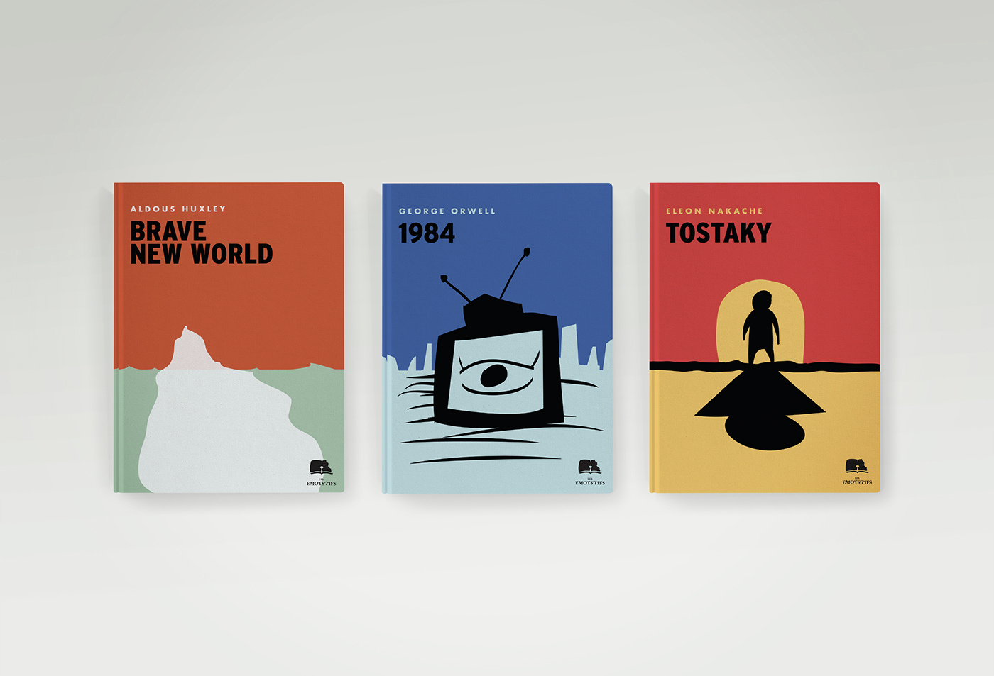
What makes a good book cover? Is it colourful? Is it illustrated? Does it convey what’s inside effectively? Though the answers to these questions may be obvious, defining what constitutes a ‘good’ book cover is in actuality hard to pin down.
For example, take a look at these covers:
Are these good covers? What factors decide whether or not minimalist covers are aesthetically pleasing? They rarely (if only subtly) express the books content and – as in the cases above – utilise colour sparingly, and yet - I’d argue - most people would consider the above examples ‘good’ covers. What factors help make this decision and why do we innately know when a cover is appealing or bad? To grasp even a liminal understanding of this, we must first understand what makes a cover ‘bad’. A Google search for “bad book covers” returned these:
What qualities effect the viability of these book covers? In the first instance, we see a particular issue with balance. Humans are inclined towards forms of balance: in faces, in art, and even in writing. Balance, symmetry – these are attractive qualities. One might assert then that this is the key to creating a good book cover, if not providing a natural first step towards this.
But that’s not all that’s wrong with these covers. Look at the second cover. Is that a man with a tank for a head? Logic (or cohesiveness) is another key element. We see in the minimalist covers that they portray very little of the book meaning in its cover and yet they function as ‘good’ book covers. In the case of the latter images, we see that sometimes a book cover can say too much to the point of possessing redundant qualities. A cover that overtly bares no relation to its contents is bad, especially when it’s clear that there is meant to be some semblance to the work itself and so we find our second characteristic of ‘bad’ book covers.
There is one last glaring problem with these covers and that is the issue of clarity. A cover that is too cluttered, is made using low-quality images, or uses fonts that are genuinely unreadable can be said to have failed in its attempt to adequately market its contents. A minimalist cover compensates for its lack of detail in other ways. These covers, especially cover 3, actively obfuscate detail and are, as a consequence, ‘bad’.
I could go into more detail. For example, Japanese novels tends to have simplistic book cover designs because consumers tend to want to put their own cover on each book in order to hide what it is they’re reading and thus a cover which, as seen by someone else might be too simplistic, is actually ‘good’ in the sense that it is tailored to the needs and desires of the consumer. But what does that tell us about ‘good’ book covers? Essentially this: two good book covers can be vastly different and so too can bad book covers. However, there are some qualities that make book covers universally ‘bad’ and these should be avoided at all cost as a first step in creating a good one. There is no formula for a good book cover, at least, not one that applies universally. However, if this blog post can provide anything, it’s a guide to avoiding missteps that will inevitable lead to the failure of your design.

